


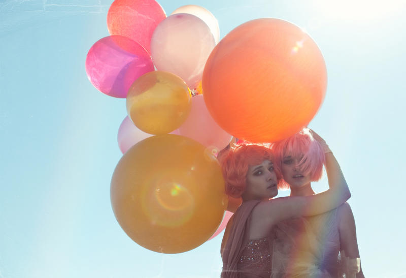
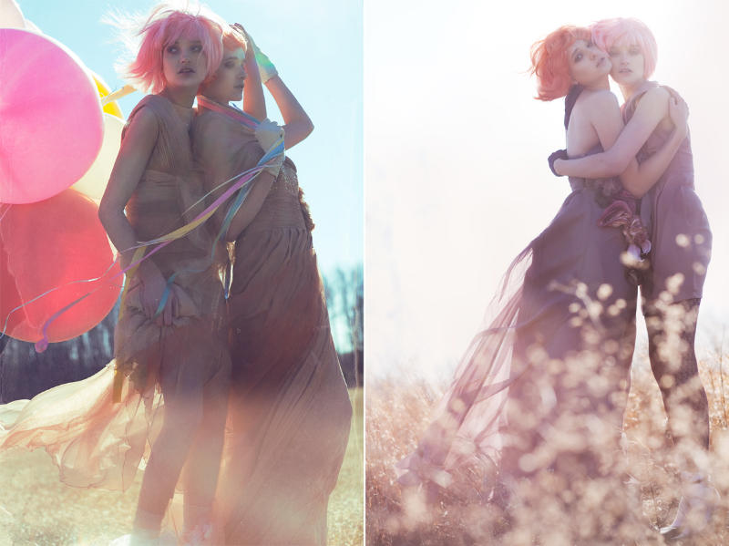
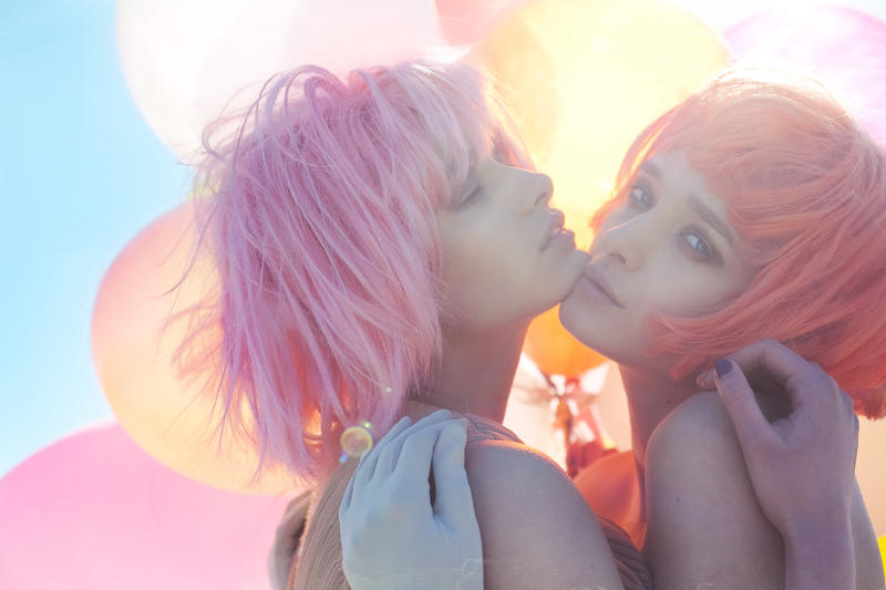
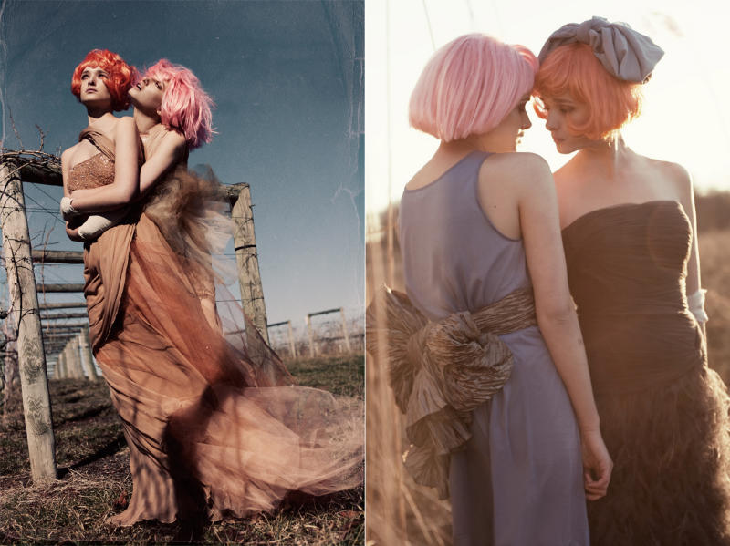
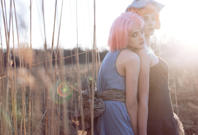
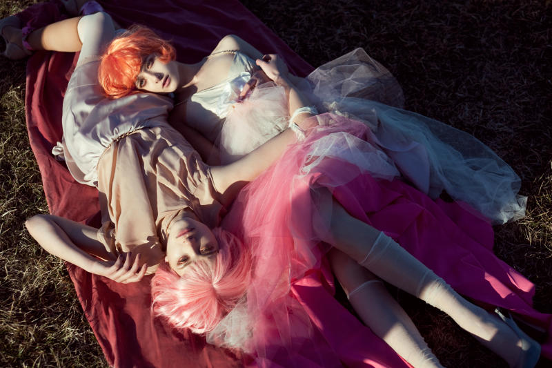
Cotton Candy Girls – Photographer Lara Jade takes to the open fields and blue skies for the latest issue of Material Girl. Working with stylist Lauren Armes, Jade captures Gigi and Irena in airy ethereal looks with pink bobs courtesy of hair stylist Damian Monzillo. / Makeup by Damian Monzillo, Retouching by Lara Jade

ohmygod…i looove the pastel colors!!!
but the photography technique is very usual
devi-kusumawardani.blogspot.com
I really love the softness of this editorial, its very beautiful!!
both girls are very beautiful
both girls are very beautiful
Amazing photography.
Amazing photography.
Great Lara Jade style.
Beautiful.
Beautiful.
Beautiful.
totally in love with the colors/ styling and photography!
btw do drop by my site as i have EXTENDED THE BRASHY x MONSTRE XI GIVEAWAY by a week. No harm trying your luck for a cool tshirt (:
x leonie
Ooooh my god, the hair and the balloons? Adorable!
Ooooh my god, the hair and the balloons? Adorable!
Ooooh my god, the hair and the balloons? Adorable!
Very cute!
Love it, the colours are very pretty
It’s good but not great.
Stupid texture adding and weird poses. All the same, no difference.
Like the styling and pastel colour blocking, but something about the photography makes the shoot seem to fall a bit short of it’s potential.
___________________________
http://theperfectplacetostart.blogspot.com/
“blah blah blah I hate on shoots like this because I am no where near as talented, and have most likely failed at photography or some other creative outlet.”
People like you make the internet suck. – Don’t like it? Offer some constructive critique, or post a link to your portfolio instead.
The person above you isn’t “hating,” they gave their opinion in a very polite and intelligent way. If they don’t like the photography, then they don’t like it, everyone feels differently about things as subjective as this editorial.
I wasn’t speaking to MathildeJohnsen – hence why the comment wasn’t a reply, rather the next in a series of comments on the images. I completely agree with you on her response being polite and intelligent.
However, “Stupid texture adding and weird poses. All the same, no difference.” How is that polite and intelligent???
oh calm down Lara!
oh calm down Lara!
Ha no, but nice. No pienso que ella puede hablar espanol jajaja, pero pienso que tu es una puta.
Ha no, but nice. No pienso que ella puede hablar espanol jajaja, pero pienso que tu es una puta.
Either stick to talking to the work or take your argument elsewhere.
(Comments have been removed from this thread for violating our comment policy. View it here.)
oh calm down Lara!
tu me parecen una putta meirda hijo de puta cuarenta y cinco anos el peluquero
tu me parecen una putta meirda hijo de puta cuarenta y cinco anos el peluquero
tu me parecen una putta meirda hijo de puta cuarenta y cinco anos el peluquero
tu me parecen una putta meirda hijo de puta cuarenta y cinco anos el peluquero
tu me parecen una putta meirda hijo de puta cuarenta y cinco anos el peluquero
lawl, why do all the Lara Jade eds bring out the fanbois sheeple
I have to say I agree about the stupid textures. They are bad enough on their own, but using the exact same one more than once…just…no
I wasn’t speaking to MathildeJohnsen – hence why the comment wasn’t a reply, rather the next in a series of comments on the images. I completely agree with you on her response being polite and intelligent.
However, “Stupid texture adding and weird poses. All the same, no difference.” How is that polite and intelligent???
“blah blah blah I hate on shoots like this because I am no where near as talented, and have most likely failed at photography or some other creative outlet.”
People like you make the internet suck. – Don’t like it? Offer some constructive critique, or post a link to your portfolio instead.
“blah blah blah I hate on shoots like this because I am no where near as talented, and have most likely failed at photography or some other creative outlet.”
People like you make the internet suck. – Don’t like it? Offer some constructive critique, or post a link to your portfolio instead.
“blah blah blah I hate on shoots like this because I am no where near as talented, and have most likely failed at photography or some other creative outlet.”
People like you make the internet suck. – Don’t like it? Offer some constructive critique, or post a link to your portfolio instead.
It means well…but there is no attention to detail…like the fact that it is a brown, dry, dirty looking setting, and the girls look cold, and those kind of cheap plastic wigs only look good when they have been trimmed..half-assed Tim Walker….not good
no chemistry between the models. they just dont look like they are close. leaves me cold.
no chemistry between the models. they just dont look like they are close. leaves me cold.
these are gorgeous.
january, x
jessicajanuary.com
these are gorgeous.
january, x
jessicajanuary.com
great!
great!
great!
The retouching on these leaves a lot to be desired, especially on that third one — the close up image. I understand that it’s probably the light coming through the balloons, but the yellow cast to their skin and that strange purple hand is very unflattering. I also agree with the previous comment that the texture on the 4th left diptych especially seems rather tacky and unfitting for the editorial. And the fact that the first couple of images the girls are really underexposed is bothering me. Reflectors! Really, they help. I’m also not a big fan of the wigs. Actually, the pink one doesn’t look so bad, but the cut on the orange one makes it look cheap.
The retouching on these leaves a lot to be desired, especially on that third one — the close up image. I understand that it’s probably the light coming through the balloons, but the yellow cast to their skin and that strange purple hand is very unflattering. I also agree with the previous comment that the texture on the 4th left diptych especially seems rather tacky and unfitting for the editorial. And the fact that the first couple of images the girls are really underexposed is bothering me. Reflectors! Really, they help. I’m also not a big fan of the wigs. Actually, the pink one doesn’t look so bad, but the cut on the orange one makes it look cheap.
The retouching on these leaves a lot to be desired, especially on that third one — the close up image. I understand that it’s probably the light coming through the balloons, but the yellow cast to their skin and that strange purple hand is very unflattering. I also agree with the previous comment that the texture on the 4th left diptych especially seems rather tacky and unfitting for the editorial. And the fact that the first couple of images the girls are really underexposed is bothering me. Reflectors! Really, they help. I’m also not a big fan of the wigs. Actually, the pink one doesn’t look so bad, but the cut on the orange one makes it look cheap.
great styling, i don’t think this photography meets the standard of the website though, studenty.
great styling, i don’t think this photography meets the standard of the website though, studenty.
It doesn’t matter with the process. the important is the result. And you’re works are amazing me! ganbatte! love lara
It doesn’t matter with the process. the important is the result. And you’re works are amazing me! ganbatte! love lara
Well-known luxury brands (Louis Vuitton). Louis Vuitton was founded in 1854?authentic louis vuitton, now part of French post-production high luxury goods group Moet Hennessy LouisVuitton?louis vuitton black. Founder of the first post of Louis Vuitton LV jewelry industry for the elite aristocracy?louis vuitton outlet?when pack when traveling. He witnessed the invention of the steam train?louis vuitton wallet, also witnessed the development of steamshipcheap miu miu?transportation?cheap fendi, but also deeply appreciate the dome was closed stacked luggage difficulties?louis vuitton sofia coppola.