Jonathan Saunders Spring 2012 | London Fashion Week

Joanna Elizabeth

/

Published September 17, 2011

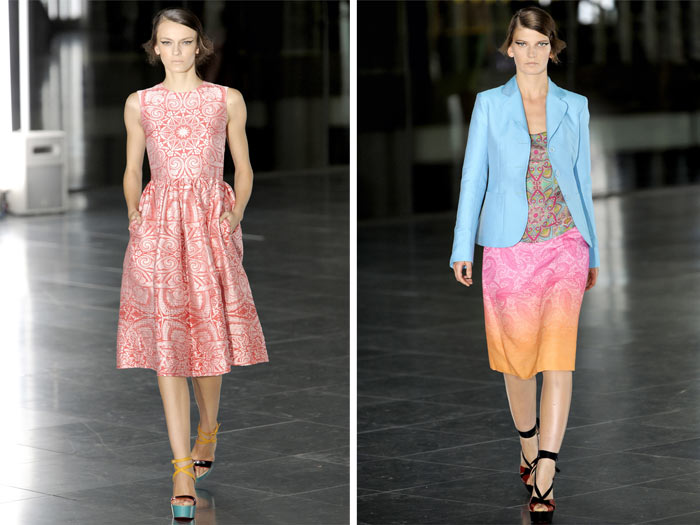
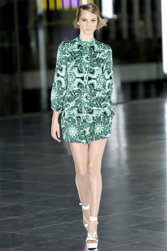
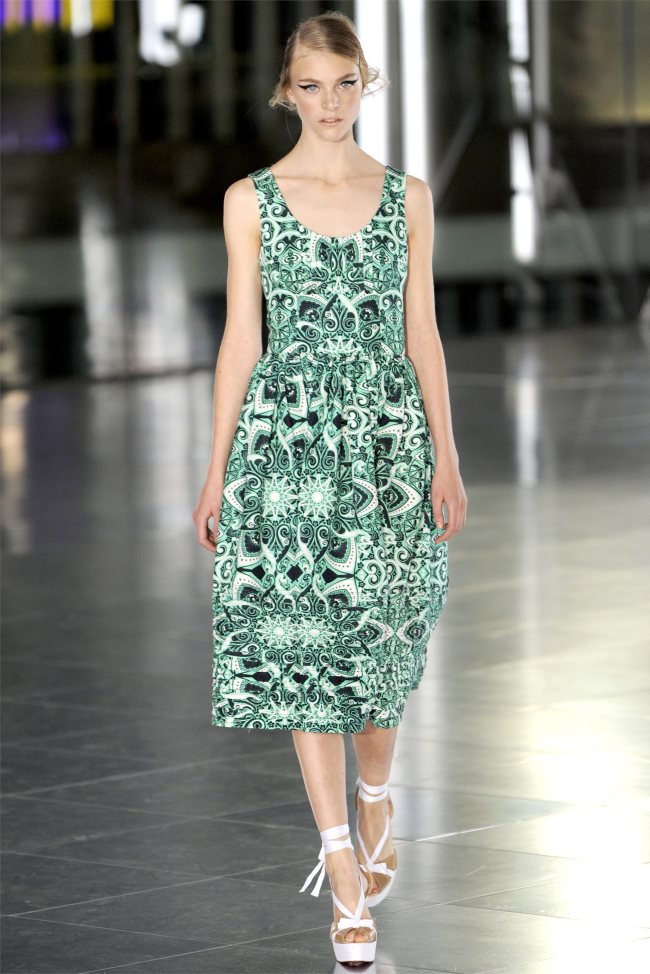
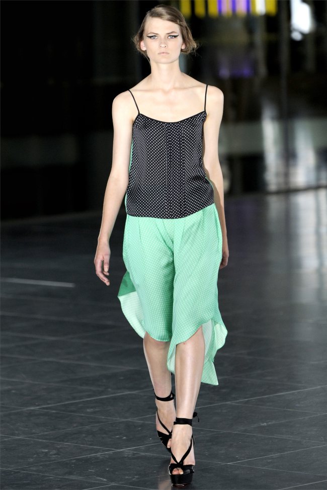
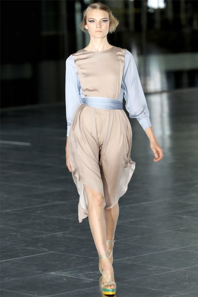
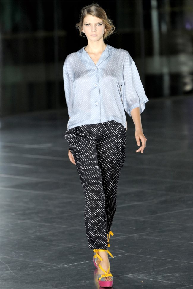
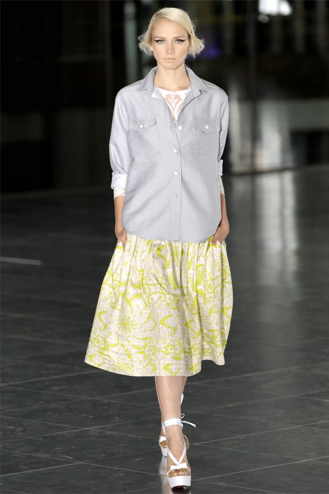
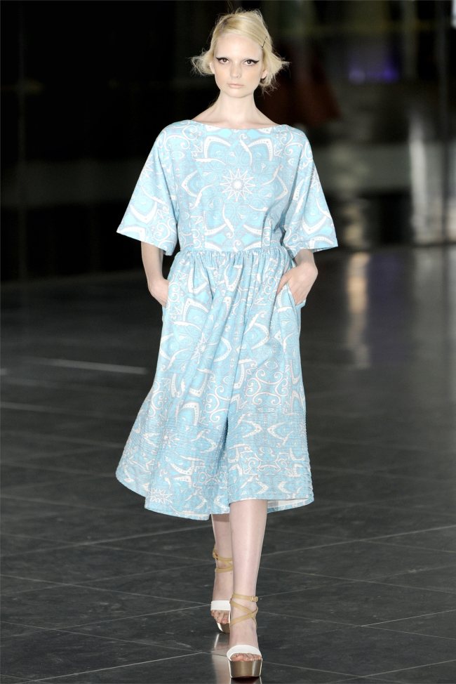
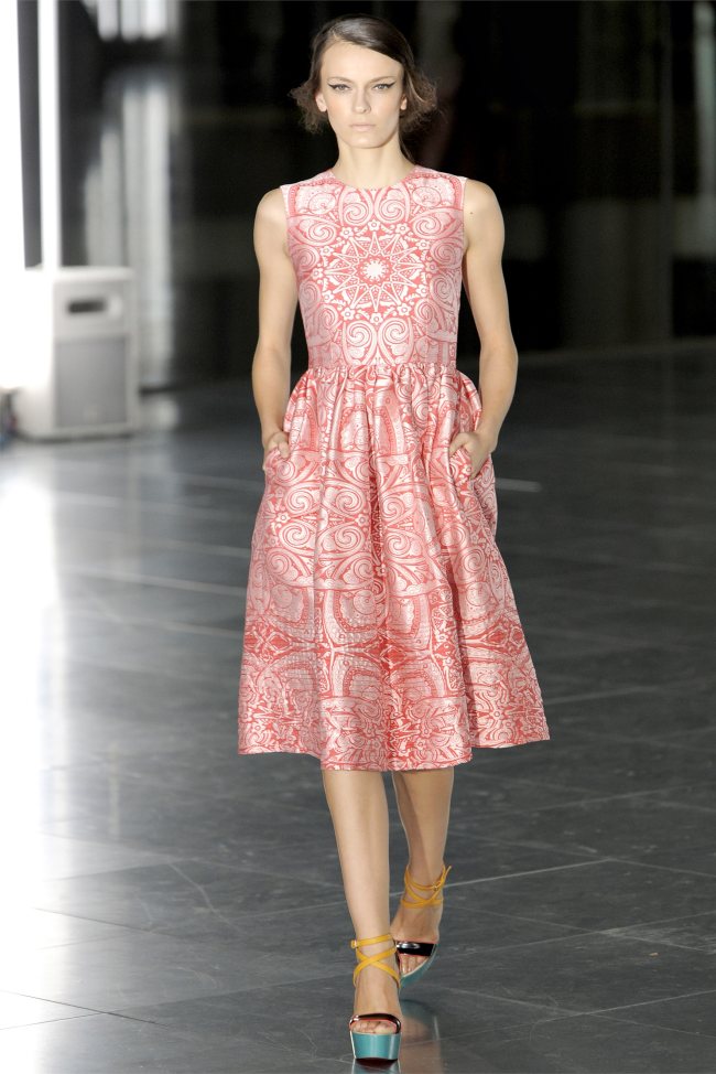
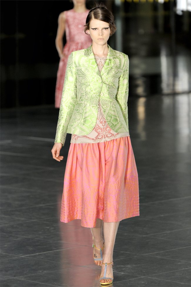
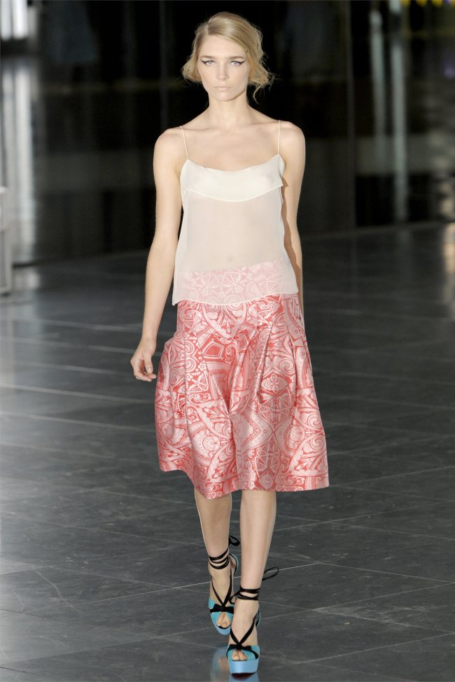
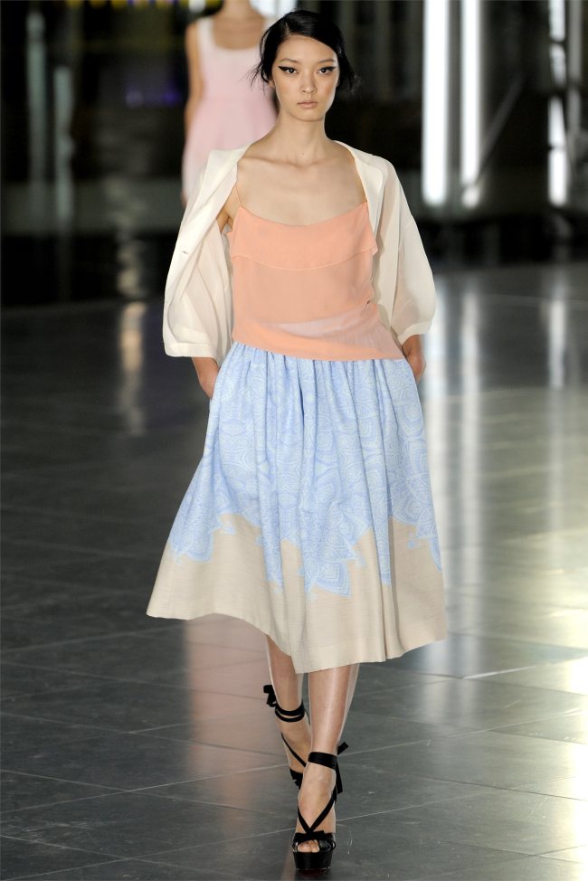
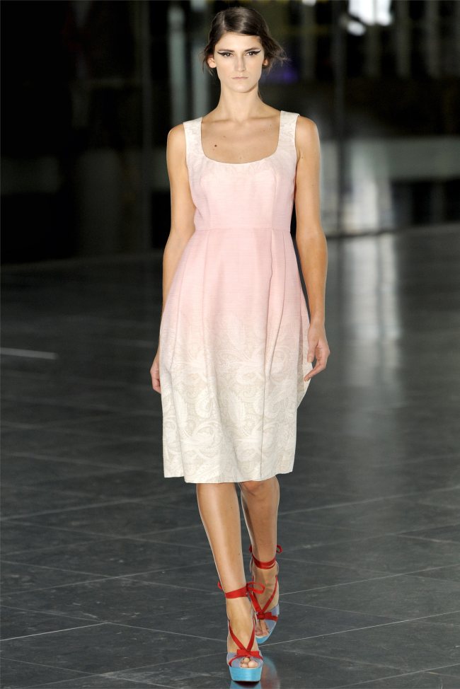
Saunders’ Spring Palette – With high anticipation, Scottish designer Jonathan Saunders presented his namesake label’s spring 2012 collection with his masterful skills of color and silhouette still in tact. Juxtaposing neon hues of pink, green and yellow with intricate patterns, Saunders used shapes as a canvas this season showing a playful mixture of color in the form of embroidered sheer dresses, lightweight jackets and gradient dyed fabric.


Pages: 1 2 3 4


Recent Updates

Jennie Gentle Monster 2024 Featured

Jennie & Gentle Monster’s New Eyewear Collab is Beyond Chic

Gentle Monster and Jennie from Blackpink join forces once again for their 'Jentle Salon' collaboration. The third collaboration between the ...
Alo Yoga Tennis Club 2024 Featured

Alo Yoga Aces the Style Game with Tennis Club Capsule

In the sun-drenched courts of chic and leisure, Alo Yoga unveils its Tennis Club collection, a tasteful nod to the ...
Kim Kardashian SKIMS Swim Featured

Kim Kardashian Sets Summer on Fire in SKIMS 2024 Swimwear

Kim Kardashian, the reality TV star turned business mogul, is once again commanding attention with her latest SKIMS Swim 2024 ...
Ferragamo Pre-Fall 2024 Featured

Ferragamo Pre-Fall 2024: Get Lost in the Fashion Fantasy

Ferragamo's pre-fall 2024 campaign fuses art, history, and fashion captured through the lens of Harley Weir. In a striking juxtaposition, ...
Jisoo Self-Portrait Pre-Fall 2024 Featured

Blackpink’s Jisoo Inspires in Self-Portrait Pre-Fall 2024 Ad

Jisoo, a member of Blackpink, enchants in the Self-Portrait pre-fall 2024 campaign, presented in a setting that's both personal and ...
Estee Lauder Legacy Featured

Carolyn Murphy Stuns in Estée Lauder Legacy Fragrance Ad

In a graceful fusion of heritage and modernity, Estée Lauder introduces the Legacy collection fragrance, a lineup of five legendary ...

5 thoughts on “Jonathan Saunders Spring 2012 | London Fashion Week”

  1. Beautiful color combinations and prints, the shapes are interesting and I dig his dynamic of very proper vs. very improper.  A lot of designers do the 50’s/60’s housewife aesthetic, but I think this is more refreshing than anything I’ve seen in a while.  Jonathan is becoming a favorite of mine.

    Reply
  2. Beautiful color combinations and prints, the shapes are interesting and I dig his dynamic of very proper vs. very improper.  A lot of designers do the 50’s/60’s housewife aesthetic, but I think this is more refreshing than anything I’ve seen in a while.  Jonathan is becoming a favorite of mine.

    Reply

Leave a Reply to hhumh Cancel reply