
Set in a serene coastal setting, Brunello Cucinelli’s summer 2024 Authentic Retreat campaign channels elegant vibes. The images conjure an ...
Laura Dern stars in the debut episode of The Vivier Express, Roger Vivier's latest foray into cinematic storytelling. Set aboard ...
The warm breeze ushers in Alexis' Veraneo summer 2024 collection, where the fashion landscape brightens with a palette rich in ...
Irina Shayk dazzles in the Missoni Beachwear 2024 campaign, captured against a striking cobalt blue backdrop. The color complements the ...
Versace's latest collection, La Vacanza 2024, channels an eternal summer aesthetic with its new campaign. The selection includes a vibrant ...
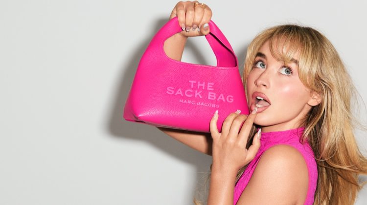
Sabrina Carpenter's vibrant role in the Marc Jacobs pre-fall 2024 ad campaign brings a stylish energy. These images, photographed by ...


lara looks good everywhere
http://sheisfashionholic.blogspot.com/
lara looks good everywhere
http://sheisfashionholic.blogspot.com/
This is the worst cover I have ever seen from Lara, it’s not bad, but its not very good either.
WHERE have her curves gone?
Lara is one of the few models I prefer with a little more meat on her bones, she lost her magic by losing weight…..
This is the worst cover I have ever seen from Lara, it’s not bad, but its not very good either.
WHERE have her curves gone?
Lara is one of the few models I prefer with a little more meat on her bones, she lost her magic by losing weight…..
Not pretty this cover, Lara does not look beautiful.
The one on the left is really horrible.
I actually disagree. I like the one on the left better. On the right she looks angry and her shoulders look too boney. I’m with Bonito Swenden (earlier commenter)! Get some meat on those bones, hon!
I actually disagree. I like the one on the left better. On the right she looks angry and her shoulders look too boney. I’m with Bonito Swenden (earlier commenter)! Get some meat on those bones, hon!
I actually disagree. I like the one on the left better. On the right she looks angry and her shoulders look too boney. I’m with Bonito Swenden (earlier commenter)! Get some meat on those bones, hon!
The one on the left is really horrible.
The one on the left is really horrible.
It is not a good cover. Blame the photographers and the editors. If they make Lara Stone look less than beautiful…. then THEY have blundered.
It is not a good cover. Blame the photographers and the editors. If they make Lara Stone look less than beautiful…. then THEY have blundered.
Not good! Too much retouching and Lara looks so different in each cover! I do not like this!
Wierd. DOesn’t even look like Lara on the left