


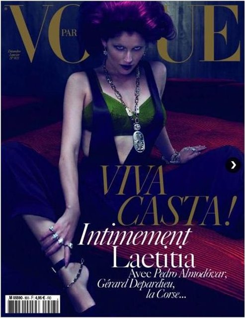
Cover | Laetitia Casta by Mert & Marcus for Vogue Paris Dec/Jan
Recent Updates

Sydney Sweeney Dazzles in Armani Beauty Lipgloss Ad
Armani Beauty ambassador, actress Sydney Sweeney, showcases her glamorous side in the latest Prisma Glass Lipgloss campaign. Known for her ...
Brunello Cucinelli Summer 2024: Serene Coastal Style
Set in a serene coastal setting, Brunello Cucinelli’s summer 2024 Authentic Retreat campaign channels elegant vibes. The images conjure an ...
Laura Dern Has a Stylish Trip on the Roger Vivier Express
Laura Dern stars in the debut episode of The Vivier Express, Roger Vivier's latest foray into cinematic storytelling. Set aboard ...
Alexis’ Veraneo Collection Brings the Heat to Summer 2024
The warm breeze ushers in Alexis' Veraneo summer 2024 collection, where the fashion landscape brightens with a palette rich in ...
Irina Shayk Gets the Windswept Look in Missoni Beachwear Ad
Irina Shayk dazzles in the Missoni Beachwear 2024 campaign, captured against a striking cobalt blue backdrop. The color complements the ...
Versace La Vacanza 2024: The Luxury of Leisure
Versace's latest collection, La Vacanza 2024, channels an eternal summer aesthetic with its new campaign. The selection includes a vibrant ...
I love her! Great cover.
I love her! Great cover.
Laetitia’s back. I’m glad
Laetitia’s back. I’m glad
this is fabulous. i wonder what satine looks like-how old she is…
this is fabulous. i wonder what satine looks like-how old she is…
Yawn.
And not because of Laetitia because she is fabulous. But we’ve seen this from Mert and Marcus before. It’s how they shoot a celebrity and in the process they’ve made Laetitia look like a dramatically colored bride of Frankenstein. It’s not edgy, it’s tired because it seems like formula at this point. Dunst anyone?
I know this is supposed to be a tie into Pedro (does that mean Laetitia and he will be doing a film now together?) but the dramatic color scheme makes no sense other than Pedro uses vibrant color too. Without any deeper meaning this seems like nothing other than a gimmick.
On a networking site, I just stumbled upon a fine art female photographer from Santa Cruz with a hippie goth gothic aesthetic. Her words and translated means odd wild and dramatic colors in compositions. But her reasons go to an attempt at a deeper narrative and exploration, she is interested in dreams and dreamtime. She seems really weird but I like that exploration even though she’s just an amateur from a small town and not NYC or London or Paris. If I wasn’t tied to the NYC as a makeup artist, I would work with her because I’m getting tired of the same old in editorial and commercial work. It all is seeming done tired and uninspired. I probably need a vacation. 🙂
My point is that this cover feels hollow and this was done by the best of the best.
Can someone please do something of value with Laetitia? Use some amateur photographer from California if you have to.
very very disappointing
very very disappointing