
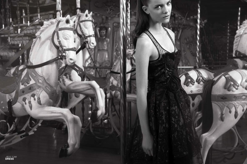
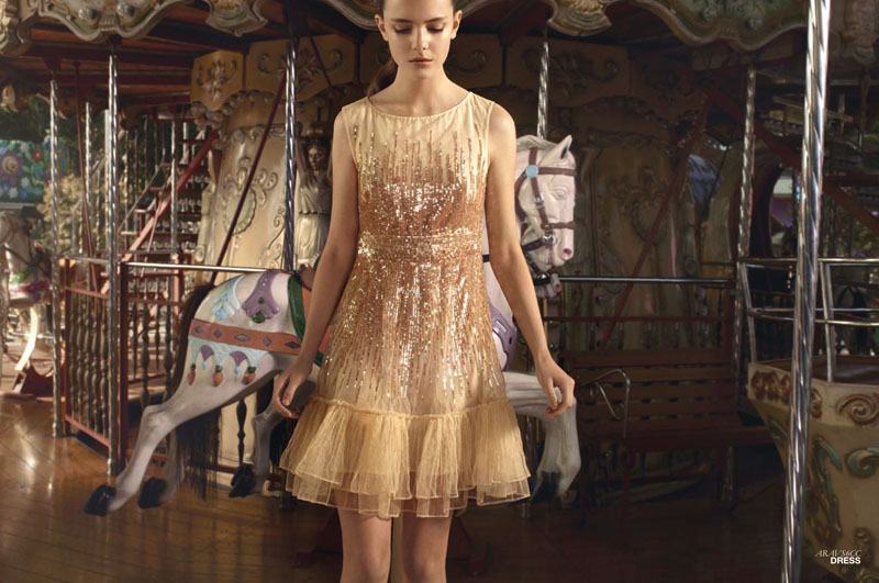
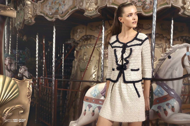
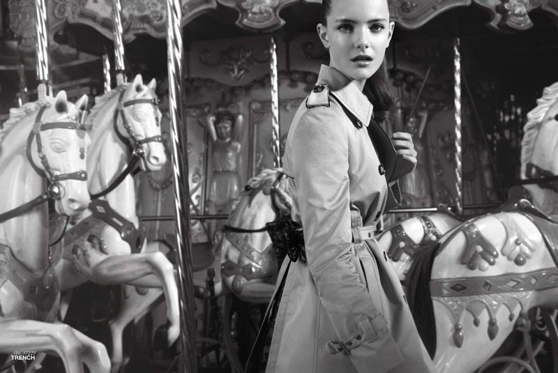
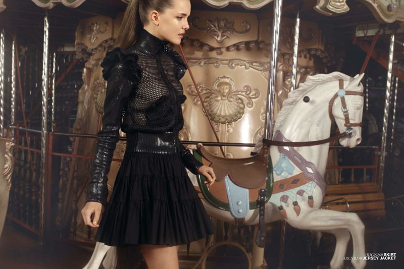
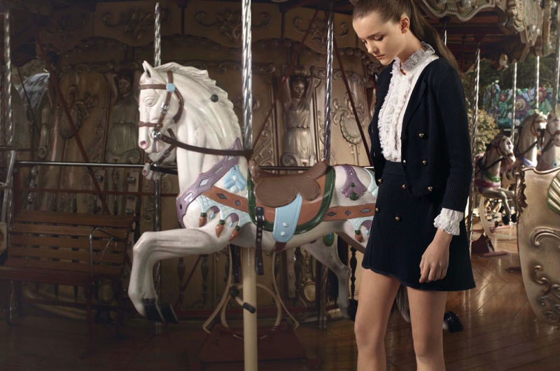
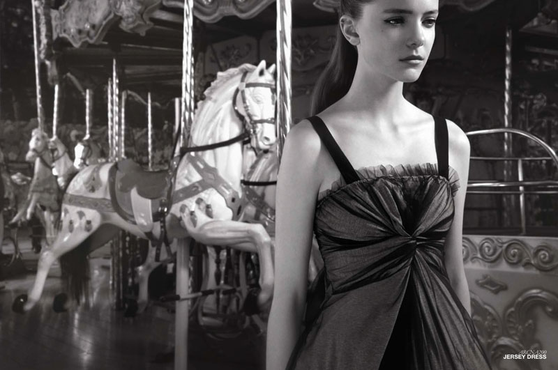
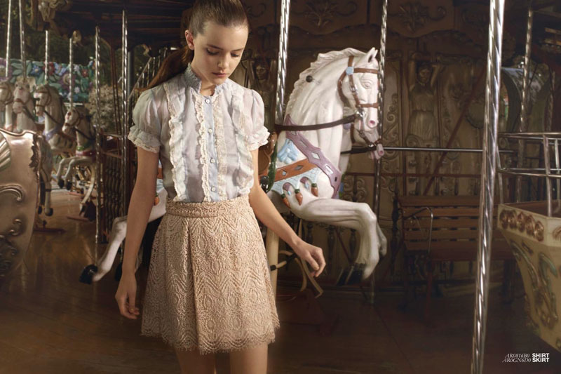
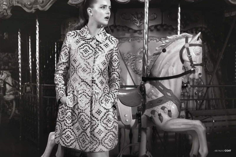
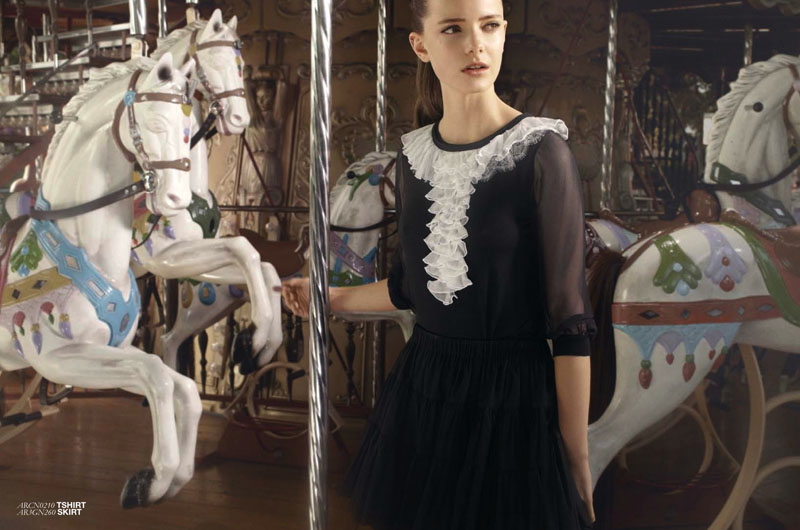
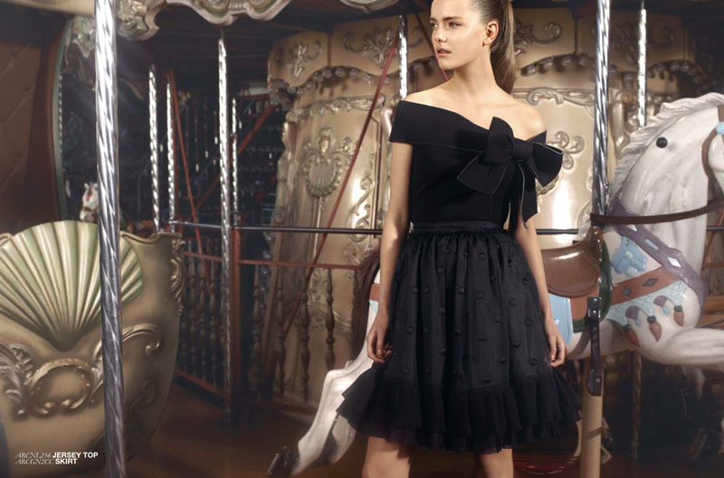
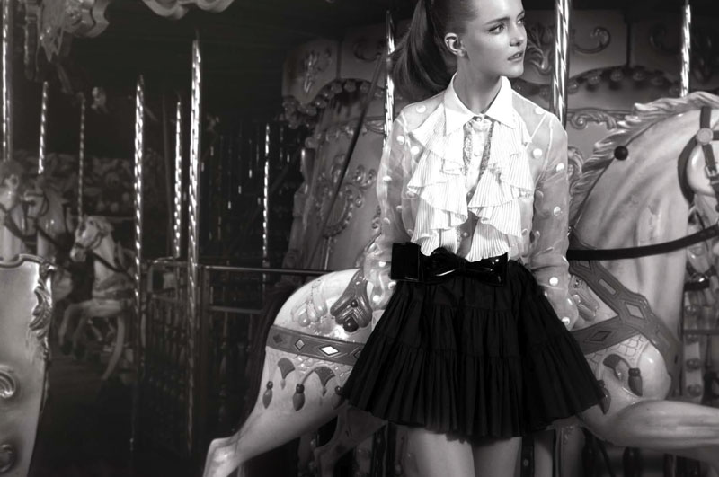
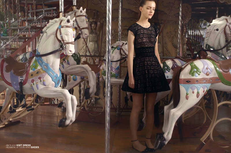
Carnival Outing – Like a little girl at a carnival, Imogen Morris Clarke stars in the spring campaign from Red by Valentino. Taking on the season’s inspiration of girlish fantasy in picture form, Imogen wows in feminine frills and womanly accents lensed by Pablo Arroyo.


This is so beautiful!!! The outfits are perfect!
XoXO
Plami
http://fashion-thrill.blogspot.com/
This is so beautiful!!! The outfits are perfect!
XoXO
Plami
http://fashion-thrill.blogspot.com/
the clothes are great, but the lighting is really not nice – there is no depth
Great campaign 😮
I love the backdrop!
http://www.myfacehunter.com/
They could have done a lot more with the set…there was so much opportunity for better poses, etc.
my thoughts exactly.
I really love this campaign…simple with a retro vibe.
http://www.nydontleaveme.com
I really love this campaign…simple with a retro vibe.
http://www.nydontleaveme.com
All of these looks are amazing, but I agree that they could have done more with the photography
It looks like she’s waiting for her boy friend! Great shoot and the clothes are killer.
Love the clothes, but the concept and the lighting seem to cheapen it.
Imogen is so cute 🙂
dresses are just so pretty, pics – nothing special, could have done so much more
http://elenavasilieva.blogspot.com/
x
dresses are just so pretty, pics – nothing special, could have done so much more
http://elenavasilieva.blogspot.com/
x
An opportunity a bit wasted. Imogen is lovely though.
An opportunity a bit wasted. Imogen is lovely though.
An opportunity a bit wasted. Imogen is lovely though.
An opportunity a bit wasted. Imogen is lovely though.
nice clothes, pretty model – but very little variance in poses, becomes quite boring. However, since this is a campaign, we won’t be seeing them all together as we do here, so it is perhaps less of a problem. Agree with previous comments that the lighting could have been much better – if it wasn’t for that picture where she has her hand behind one of the poles, I would begin to wonder if she was just standing in front of a picture of a roundabout.
________________________
http://theperfectplacetostart.blogspot.com/
I don’t think the lighting is too bad, but the compositions are all quite similar and there is a lot of cropping of the top of the model’s head. Not that I don’t like that, but there is a lot of it here. I’ve scrolled down now and I can’t remember what the different comps were, they are all the same in my memory.. half were black and white.
whats with the head choppin’?