
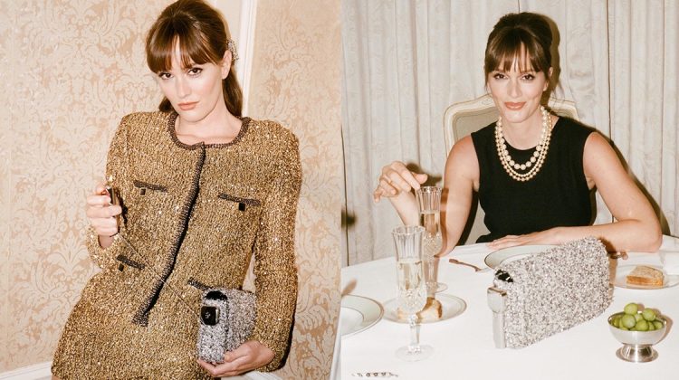
Kate Upton captures the essence of contemporary femininity in Anne Klein's spring-summer 2024 campaign, delivering an array of looks that ...
Warm weather is perfect for experimenting with bold, vibrant, and whimsical summer nail designs. From psychedelic swirls on stiletto shapes ...
In a striking fashion feature captured by Carmelo Donato, FGR's latest exclusive focuses on denim, with models Alina Enders and ...
Logan Hollowell, known for its fine jewelry, ventures into ready-to-wear with the debut of its Silk Collection. The 100% silk ...
Ana de Armas captivates in Estée Lauder's latest advertisement, embracing the opulent glow of the new Re-Nutriv Diamond Serum Lipcolor ...
Spell's latest Renew collection marks a decade of the beloved Bohemian Royale print, demonstrating the brand's commitment to sustainable fashion ...


BORING
http://whycantmybestfriendbeme.blogspot.com/
It is boring but she is so talented I don’t even care. I just saw Black Swan…oh my god. She better win best actress at the Oscars.
that’s exactly what i thought. the cover might be boring, but who cares if it’s natalie )
Agreed 100%.
Can’t wait to see Black Swan.
http://thechicaddict.blogspot.com
well, it certainly makes any Harper’s Bazaar (even if photographed by a creep) cover take the lead when you see what US Vogue comes up with nearly every month.
is not boring, is perfection
She’s so stunning but this cover is just dreadful, no?
her hand is so awkward.
The dress is really cute, ut her face and the pose is akward!
She looks BORED of out her mind. And so am I. Yet another FAILED cover for US Vogue. New Year didnt teach them anything.
Natalie is gorgeous and the film is a psychological thriller, why make her look so placid and BORED, they could have put more depth/charactor into the photo. Why does Vogue US get such accolades and wows when it is stale and sooooo old fashioned. And not in the Mad Men way.
The otherwise pointless elevation of Natalie Portman has coincided with, and will probably be remembered in association with, what is hopefully the nadir of Jewish American culture (the bloom of Jewish imperialism, the stench of the association with Dershowitz, etc).