
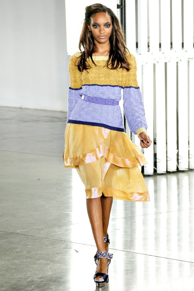
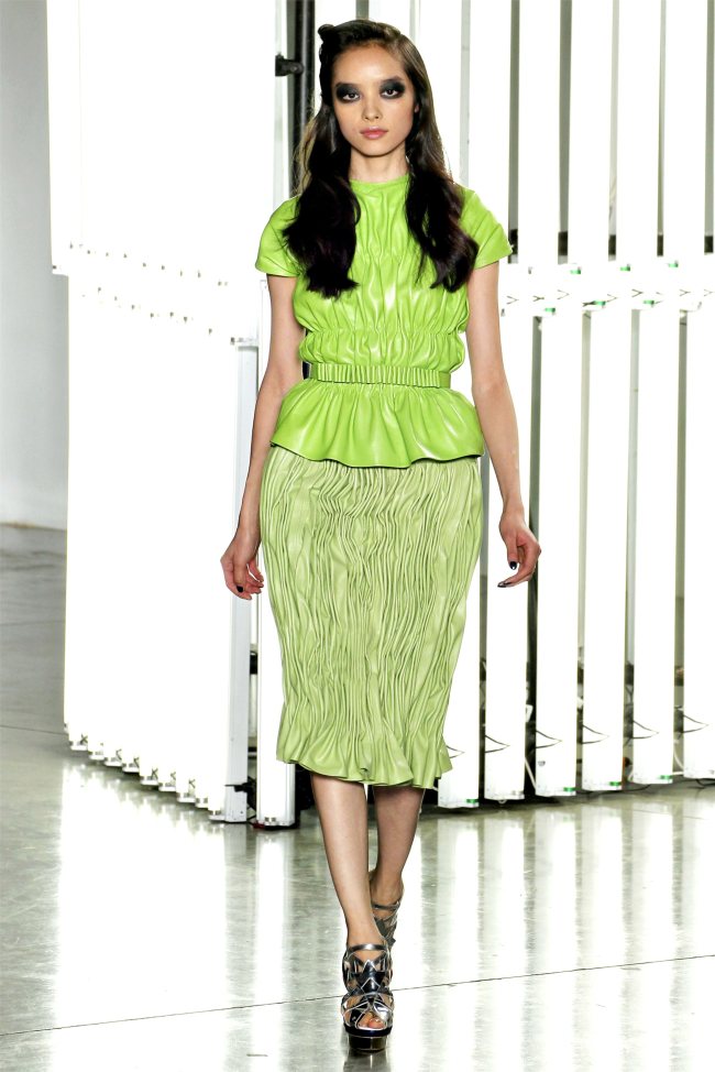
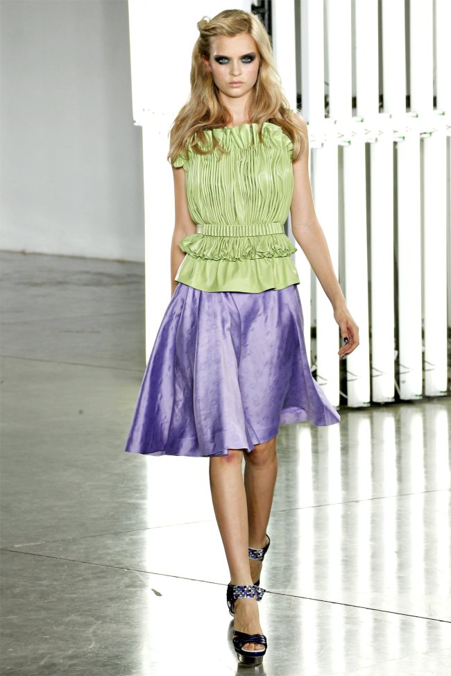
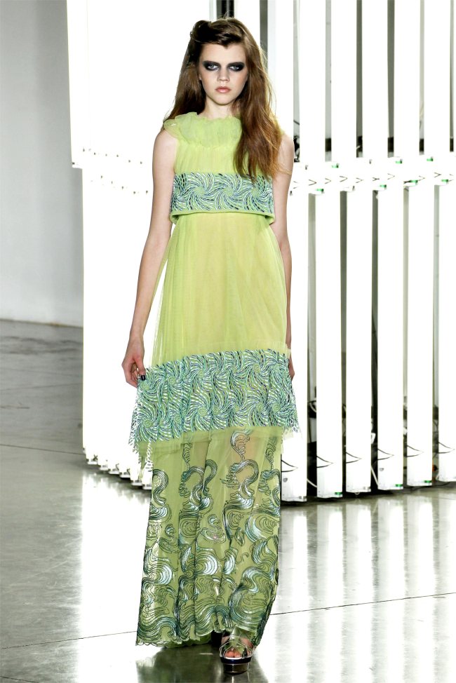
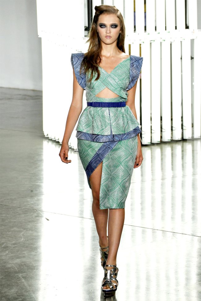
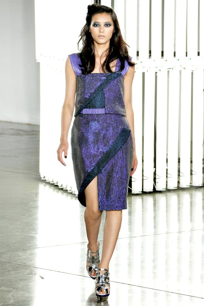
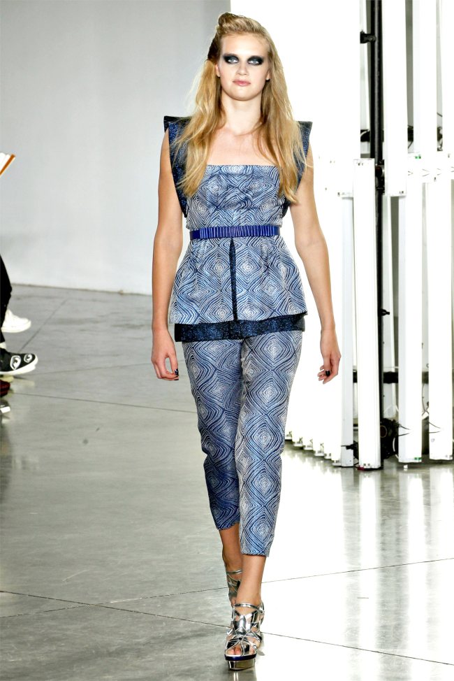
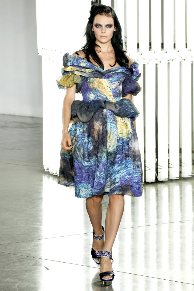
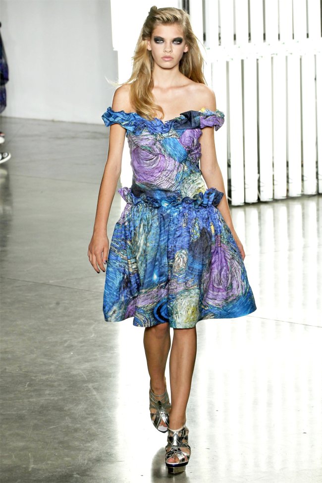
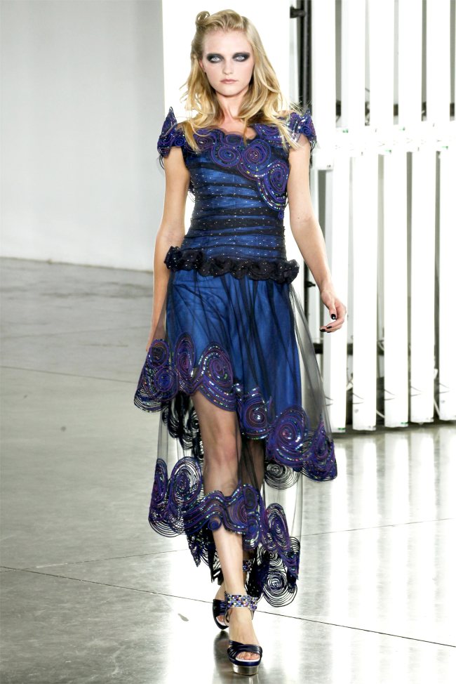
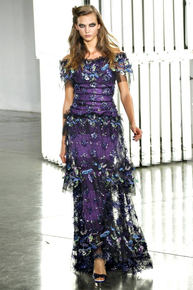
Rodarte Spring 2012 | New York Fashion Week
Recent Updates

Kate Upton Lights Up Anne Klein Spring 2024 Ad
Kate Upton captures the essence of contemporary femininity in Anne Klein's spring-summer 2024 campaign, delivering an array of looks that ...
Summer Nail Designs: Ideas to Obsess Over in 2024
Warm weather is perfect for experimenting with bold, vibrant, and whimsical summer nail designs. From psychedelic swirls on stiletto shapes ...
Exclusive: Alina & Jette by Carmelo Donato in ‘Denim Remixed’
In a striking fashion feature captured by Carmelo Donato, FGR's latest exclusive focuses on denim, with models Alina Enders and ...
Logan Hollowell’s Silk Collection Delivers Goddess Glam
Logan Hollowell, known for its fine jewelry, ventures into ready-to-wear with the debut of its Silk Collection. The 100% silk ...
Ana de Armas is a Vision in Estée Lauder Lipstick Ad
Ana de Armas captivates in Estée Lauder's latest advertisement, embracing the opulent glow of the new Re-Nutriv Diamond Serum Lipcolor ...
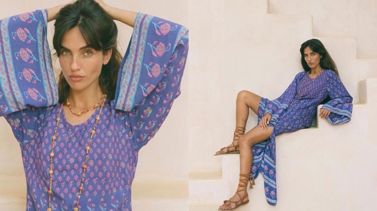
Spell’s Bohemian Royale Print Gets an Eco-Chic Makeover
Spell's latest Renew collection marks a decade of the beloved Bohemian Royale print, demonstrating the brand's commitment to sustainable fashion ...
I pretty much love it all!
Sooo happy Vlada was in it!!!
WTH??? it’s like 80s fashion gone bad.. like it wasn’t bad enuff the first time.. 🙁
I like how they used Van Gogh, but I feel that to make it work the make-up should have been much softer…
I love this collection, especially the featured blue dress.
fuck that makeup sucks
omg… the makeup draws the eye away from the awesome color palette used. Oh, and I agree… the 80s ripoffs are atrocious! Ew ew ew! The only time it looked presentable was on the lady in the first pic on the 3rd page. She rocks the “sunken eyesockets” look… other models are drowning in that black hole.
I have mixed feelings. At it’s best this collection offers dreamy fantasy, lovely looks in dazzling colors. However, while I adore Van Gogh, it seems that they mostly used the inspiration in obvious ways, and that they missed the unsettling aspects of Van Gogh’s work. It’s Van Gogh Disneyfied.
Also, some looks are too boxy or shapeless, and I don’t think the star shoes suit the collection at all.
Charming, but not their best.
Agreed with you about their van gogh reference. very obvious, not true to him in spirit though
There are many aspects of this that I love – the pleating, the gathering, some of the prints, but it feels very streamlined to me. I miss Rodarte’s days of 9 zippers on a dress and confusing details – what happened to that kind of chance-taking and spontaneity?
Beautiful everything: colors, patterns, shapes! Except make-up 🙁
http://www.facebook.com/STYLISMATIC
Beautiful everything: colors, patterns, shapes! Except make-up 🙁
http://www.facebook.com/STYLISMATIC
The color palette is so amazing! I hate those school marm prints from the 80’s but somehow they made them gorgeous!
http://www.tinyfrockshop.com