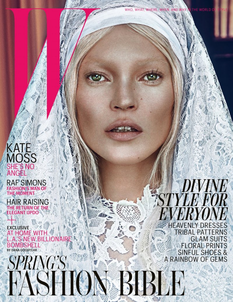
The Good and the Bad – Kate Moss goes from angelic in white to devious in black for the March cover of W Magazine. Wearing lacy looks, Kate poses in front of Steven Klein’s lens.
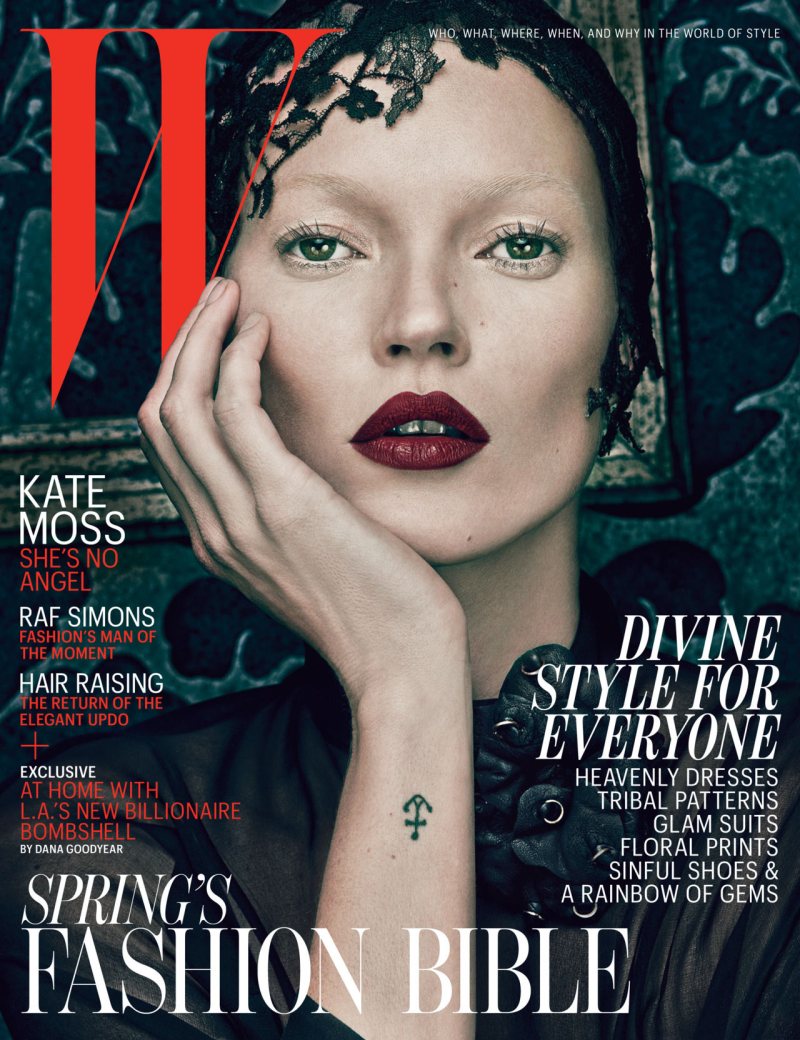
The Good and the Bad – Kate Moss goes from angelic in white to devious in black for the March cover of W Magazine. Wearing lacy looks, Kate poses in front of Steven Klein’s lens.

Dye on Kate’s eyebrow’s = a mistake.
yes kate, your eyes are killing it, even if your skin is needing high end retouche =)
Yeah, her teeth! They look like they’re dead and about to fall out. I’d really like to understand what they were thinking. I mean it’s Steve Klein and W, they must have gone for this look for a reason.
Perhaps just a reference to the Middle Ages?
Her teeth on the “angelic” cover are super distracting and quite off putting. I think keeping her teeth like that was on purpose, especially in the “good girl” cover. Perhaps to juxtapose her hard partying, “I don’t give a f*ck” realness with the angelic facade? I’m liking the “devious” cover more.
http://www.mishmashmosh.com
amazoing 🙂
http://haideeandco.blogspot.com
Striking! Can’t decide which one is better.
I didn’t even notice the discoloration of her teeth until after reading the comments.
<3 kate & steven
living on cocaine and coffee will have side effects
Now this is baaad